Thursday, 16 February 2012

Walk Cycle Exercise

In this exercise, we are required to animate a rig to do a walk cycle. The walk cycle must include all most of the animation principles, which were taught to us by our tutor. The principles are mainly 'ease in and ease out' and 'anticipation'.
For example, when the legs are moving upwards, it will slow down and when the legs are moving downwards, it will speed up. This is because of gravity.

Examples of my work is shown below:

Video 1: Front-view of Walk Cycle Animation

Video 2: Side-view of Walk Cycle Animation

Video 3: Perspective-view of Walk Cycle Animation

Video 4: Front-view of Walk Cycle and Box Jump Animation

Video 5: Side-view of Walk Cycle and Box Jump Animation

Video 6: Perspective-view of Walk Cycle and Box Jump Animation

Monday, 13 February 2012

Big Dog Exercise

Video 1: Big Dog Kick Start Animation

In this exercise, I have put what I learnt to the test. For example 'ease in and ease out' and anticipation. The 'ease in and ease out' can be seen on the legs, when the legs are lifted up, it will slower than when the legs are moving downwards to maintain balance. This is mainly because gravity is acting on the legs. I also added anticipation into my animation at the beginning and the end. The slight movements at the beginning and at the end will lead the audience to what is going to happen next.

Figure 1: Big Dog Animation StoryBoard

Sunday, 12 February 2012

Weight Shift Exercise

Video 1: Spidey Weight Shift Animation

In this weight shift exercise, I learnt many important concepts of animation. The important concepts that I learnt are:

Key extreme poses
Key extreme poses are key frames that are the most critical positions of the character. These key extreme poses best describes what the character is doing or experiencing. For example if we go back to the bouncing ball exercise, the key extreme poses will the highest points and lowest points of the ball.

In-betweens
In-betweens are key frames placed in between key extreme poses. It helps to enhance the animation by tweaking the animation to make it look more realistic. In-betweens can help incorporate 'ease in and ease out' into your animation, which will be discussed down below.

Straight ahead method
The straight ahead method is the easy but tedious method and not much planning for the animation (storyboarding) is needed to be done. The straight ahead method is to set a key frame one after another, hence resulting in a lot of key frames at the end. If a change is needed to be done in the animation, everything after the change will have to be re-done as well. Hence, this method is not as efficient as the pose to pose method which will be discussed down below.

Pose to pose method
The pose to pose method is by a more complicated but more efficient method. This method only requires the key extreme poses to be set in and then after that work on the timing and in-betweens of the animation. For this method to work, a lot of planning is needed to be done. For example, all the key extreme poses will have to be drawn out, for the animator to visualize. This method is more efficient because if any changes are need to be made, the animator only needs to tweak the key extreme poses or the graph editor, and the result of the animation will follow suit to the change.

Ease in and ease out
Ease in and ease out is to help the animation to look more realistic. Ease in and ease out describes inertia and gravity. It can be done by going to the graph editor and tweaking the tangents.

Anticipation
Anticipation usually occurs before the character does a movement. Anticipation can be a small action done by the character that leads to a larger and more exaggerated action. It allows the audience to follow the character and get a clearer picture of what the character is doing, rather than immediately jumping into the action without warning. Hence, anticipation helps to make the animation look more realistic and it is one of the key principles of animation.

Rigging Exercise


In this exercise, I learnt a few techniques on rigging. Firstly, use the joint tool to create the skeleton of the model. Keeping in mind the anatomy of the model, where I place the joints is very important. After setting up the skeleton, I will move on to naming every single joint of the model.

Next, using the orient joint tool, I will have to make sure all the joints are oriented in the right direction, if not many difficulties will be faced later. I found this part the most difficult to grasp, as you have to now which axis to select.

After every joint is oriented in the right direction, I moved on to setting up the controllers for the legs, arms, hip, spine and the head, constraining every controller to their respective areas. I found this part the most confusing and got stuck at the elbow controllers. I solved this problem by consulting a friend and looking into his rig.

Lastly, I skinned the model to the skeleton and did the weight painting. The weight painting was tedious and I found out that it had to rely a lot on my artistic instinct. As my artistic instinct was extremely limited, the result of the weight painting did not turn out so well, resulting in some parts of the model folding in an awkward manner as I move the controllers.

Overall, I found this exercise extremely enriching and useful. I feel that in this exercise, I have only seen the tip of the iceberg in terms of rigging. I would definitely look up more about rigging to improve my rig. 


Figure 1: Reference image 1

This is the reference image for the first pose. It was taken from http://yourpaperboats.blogspot.com/2007/06/swan-lake.html

Figure 2: Pose no. 1

Figure 2 shows the first pose that I did with the rig. The pose is fairly simple to do, as it is just a few translations away from the T-pose. This pose stretches the four extremities of the model, thus I find this pose quite relevant to this exercise, whereby it really puts the rig to the test.

Figure 3: Reference image 2

This is the reference image for the second pose. It was taken from http://www.boston.com/bigpicture/2009/06/dance_around_the_world.html


Figure 4: Pose no. 2

Figure 4 shows the second pose that I have done with the rig. Once again, it puts the rig to the test but maintaining the elegance of the model at the same time. Hence, I chose this pose.

Figure 5: Reference image 3

This is the reference image for the second pose. It was taken from 

Figure 6: Pose no. 3

Figure 6 shows the last pose that I did with the rig. From the pose, you can clearly see the reverse foot lock in action. 

Tuesday, 24 January 2012

More different poses~

In this exercise, we are given a different rig to work with. The poses that needs to be done are also a little different. The poses are more candid and relaxed as compared to the spiderman poses.

Figure 1: Reference image no. 1

Reference image no. 1 taken from  http://us.123rf.com/400wm/400/400/logos/logos1101/logos110100001/8609548-smiling-girl-sitting-cross-legged-on-bed-with-photo-album.jpg

Figure 2: Pose no .1

The pose in Figure 2 was quite easy to do, as it is a common pose that you can see everyday, hence it is easier for me to visualize how the pose should look like in the most comfortable and relaxed manner. Although the pose is easier to do, the rig is much more difficult to work with as compared to the spiderman rig. 

Figure 3: Reference image no.2

Reference image no. 2 taken from  http://yeinjee.com/wp-content/uploads/2010/09/girls-generation-spao-3.jpg

Figure 4: Pose no. 2

This is pose no. 2, realized that I need to work on the facial expressions.

Figure 5: Reference image no. 3

Reference image no. 3 taken from http://cruiseweb.com/rci-imagelibrary/RCI_Jewel_BasketballGame-w540.jpg

 Figure 6: Pose no. 3

For pose no. 3, I need to focus on the weight of the model. As in which foot is the weight on? Is the model leaning to the front or the back?

Wednesday, 18 January 2012

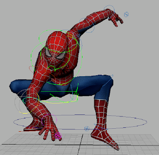
SpiderMan poses exercise

Figure 1: Reference image no. 1

This is a reference image taken from http://spidermanmarvellegends.5-is.net

Figure 2: Pose no.1 front-view

I tried to do the pose in Figure 1 in Maya. This is the front-view of the pose that I did. In the exercise, I am focusing on balance. This means that the model's poses must look natural / comfortable / relax. The only problem that I encountered was when positioning the arms, the flesh on the arms will somehow look twisted.

Figure 3: Pose no. 1 side-view

This is the side-view of the pose that I did.

Figure 4: Pose no. 1 side-view

In this side-view, you can see the curves of the body in highlight.

Figure 5: Pose no. 1 side-view

In this side-view, you can see the center of gravity of the model. In this case, the center of gravity is around the belly button of the model.

Figure 6:  Reference image no. 2

This is a reference image taken from http://www-deadline-com.vimg.net/wp-content/uploads/2010/01/delays-spidey.jpg.

Figure 7: Pose no. 2 front-view

I tried to do the pose in Figure 7 in Maya. This is the front-view of the pose that I did. Keeping in mind the importance of balance in the pose, I changed the pose of the left leg to look like the model is trying to reach forward by stretching out his left leg, as the model is in a swinging motion. However, in this pose, there are still some minor defects that can be observed.

Figure 8: Pose no. 2 side-view

This is the side-view of the second pose that I did. 

Figure 9: Pose no. 2 Defect no. 1

From the highlighted lines on the legs in Figure 9, you can see that the legs does not lead the audience back to the model. In Figure 6, the legs of the model leads the audience back to the model which makes it more interesting to look at.

Figure 10: Reference image no. 3

This is a reference image taken from http://junal.files.wordpress.com/2007/08/spiderman.jpg.


 Figure 11: Pose no. 3 front-view

I tried to do the pose in Figure 10 in Maya. This is the front-view of the pose that I did. There are some obvious defects in the pose that are a little different from the reference image. The errors will be shown in Figure 13 and 14 below.

Figure 12: Pose no. 3 side-view

This is the side-view of the third pose that I did. 

Figure 13: Pose no. 2 Defect no.1

The first error is in the right leg of the model. The right knee should not be opened up so wide. It should be rotated along the x-axis to point forward a little bit more.

Figure 14: Pose no. 2 Defect no.2

The second defect is in the right arm of the model. The right arm should be reaching out more and positioned around the center of the body. I tried correcting both defects, but the right arm and leg of the model end up overlapping, causing it to look unrealistic.

Monday, 9 January 2012

E-Learning Week 1: Character Modelling


Figure 1: Cow Head

Attempted the e-learning lab on modelling a cartoon cow head. Figure 1 shows the final product of the cow head. Looking at it from different perspectives, I think it looks more like a bear head. :) In this e-learning exercise, the focus is on Proportion, Balance and Topography. Hence, I will be striving to perfect my model according to the three aspects stated above.

Redo of Cow Head and Body!

Figure 2: Cow head and body production phase

In Figure 2, it shows the half completed cow head and body. There are still many errors/defects, which will be corrected in the next few screen shots.

 Figure 3: Close-up of the model

Can you spot any of the defects? :)

Figure 4: Completion of Cow model with defects

The major defects are in the neck and shoulders of the Cow model. The close-ups are shown below.

Figure 5: Side view of completed cow model

From this side view, you can see that the cow's neck is too narrow and the arms are too low, making the shoulders look like it is drooping down.

Figure 6: Defect no. 1,  narrow cow neck

Cow's neck is too short and narrow, which will be adjusted to the correct proportion to suit the whole balance of the model.

Figure 7: Defect no. 2 , droopy shoulders

I feel that the droopy shoulders of the cow are affecting the whole proportion and balance of the model. 

Figure 8: Defect no. 1, Solved!

I realized that the problem causing the defect was because I only did 2 merges of a total of 4 vertices. This caused the left and right side of the neck to lump into the center. Hence, the neck seems narrow and unrealistic. I solved the problem by deleting all the faces of the neck. Then I extruded the base of the neck which have a total of 6 vertices. Lastly, I did 6 merges of a total of 12 vertices to form the corrected cow's neck. 

Figure 9: Defect no. 2, Solved!

I selected the faces of both the arms and used the move tool to move the arms up along the y-axis. This immediately made the shoulders look less droopy and more realistic, balancing the proportion of the cow body.

Figure 10: Front view of final completed model

The topography, proportion and balance of the model looks alright as a whole. :)

Figure 11: Side view of final completed model

Looks gooood...

Figure 12: Back view of final completed model

All done! :)